Sites Lists
Web Portal Desktop
2021
How can we redesign the existing experience to be more intuitive?
About the project.
The product, feature, and overall goals.
Company
BlueFletch - a company focused on software and management of enterprise rugged Android devices.
What is the product?
The EMS (Enterprise Mobile Security) portal is a product aimed to help manage rugged android devices used by employees, typically in settings such as retail.
What does this portal do?
EMS can help managers or IT professionals monitor the battery life of devices, quickly and easily send updates, ensure the security of the device, and more.
What is this feature?
Sites Lists is a page within the larger EMS portal that contains information on various locations - or sites - a company may have.
Over time, if there are changes to the number of locations, a new version of a site list could be uploaded.
Overall Goals
The web portal underwent a redesign of the entire portal in order to create a more intuitive experience and modernize the design.
The team, tools, and timeline.
My Role
UX Design Intern
The Team
UX Designers
Developers
QA Engineers
Product Manager
Platform
Desktop web portal
Tools
Sketch
Zeplin
Defining the problem.
Evaluating the existing experience.
Sites Lists (called Sites before the redesign) contains a list of sites, or store locations. Of these, only one list can be active at a time. This is shown and changed from the “In Current” column with a toggle (if the toggle is on, the site is active).
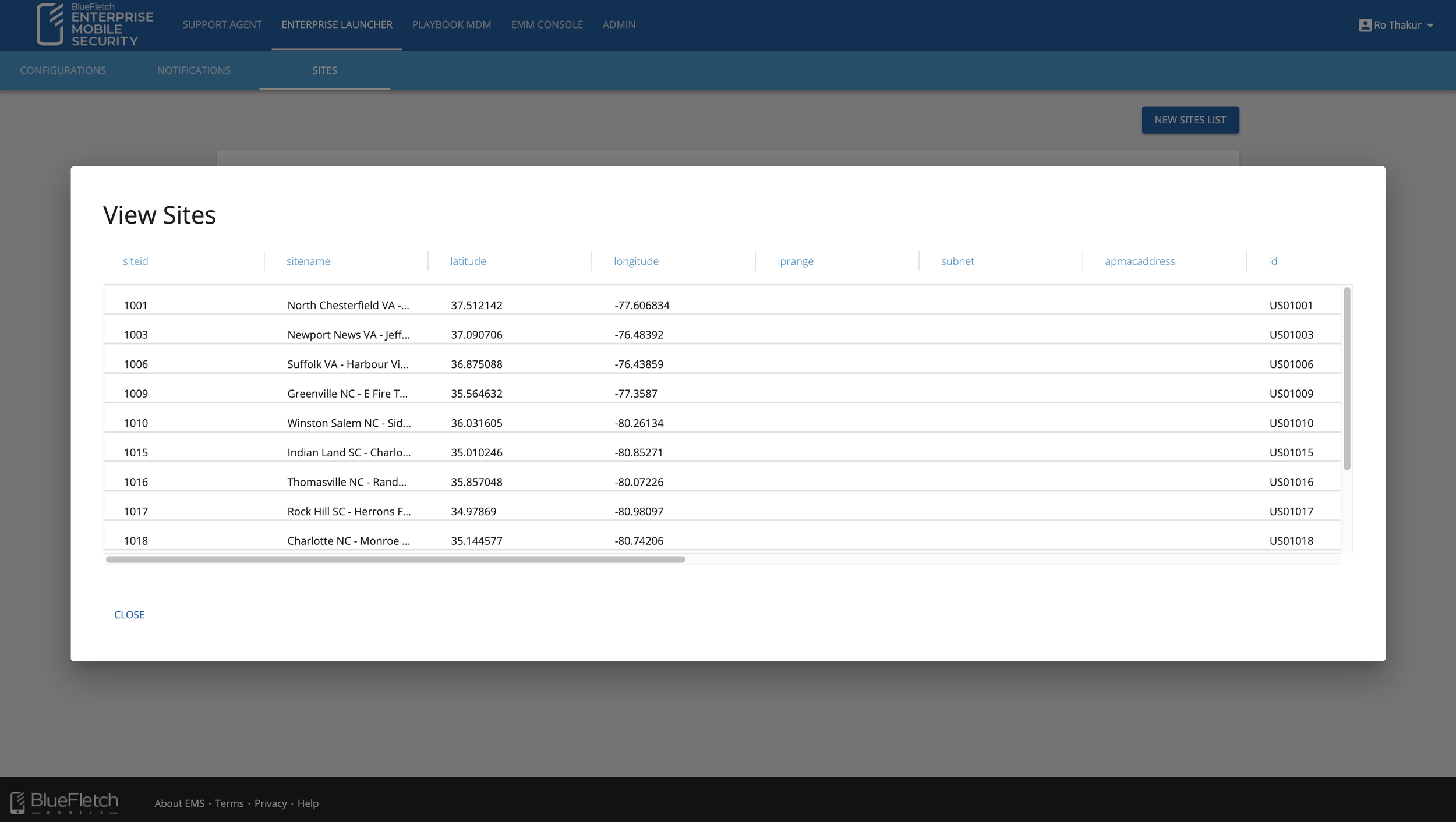
Clicking on the “View” icon will bring up the Version Details (called View Sites before the redesign). It is possible to filter, move the columns, and perform other actions, but the icon for this does not appear until a user hovers on the column.
The function of this overall page may not be immediately apparent for a new user, and the toggle method may not be the most clear way of showing if a site list is active - especially since it seems like multiple sites could be active at once.
Opportunities in the redesign.
Based on the review of the existing experience, the main goals for this redesign include:
Find a way to clearly distinguish active and inactive site lists.
Find a more clear method of activating and deactivating site lists.
Make actions such as filtering and sorting more clear.
Overall modernize the interface to be consistent with the redesign of the rest of the portal.
Exploration.
Early ideas.
Since the developers on the EMS team are also Admin and Super Admin Users of the portal, I spoke with them to gain an understanding of the goals and functions of Sites Lists, and the most important features and actions.
Determining the most important features and actions helped determine hierarchy, and what kind of actions could be in a menu or presented as more quick action buttons.
I began the process by sketching out ideas and translating those hand-sketched ideas to low-fidelity and mid-fidelity wireframes.
The page went through many rounds of iterations with the feedback of the other UX Designers, as well as the rest of the team.
The earliest version applies new styling to the existing page. However, this did not solve the functionality issues.
Next, I designed variations of a large active card with the version history to the side. However, this was not an efficient use of space.
What is the best way to show an active site list?
There was a lot of discussion on what would be the best way to show an active site list. Some possibilities included:
An Icon
Radio Buttons
Outlining the Card
Status Chips/Pills
As the design evolved, all the cards were made a standard size to use the space better. A chip indicated the status of an active site list, and the inactive site lists would be placed below in the version history.
We found that the placement of the “+ New Site List” button in previous created inconsistency across the portal, and it was moved back up. The active version was highlighted through an outline and a chip.
What is the best way to present data?
During discussions with the team, there was the question of which method would be best for presenting data: tables or cards?
I read up on this topic more and found each had its own merits, depending on the use.
Tables:
Easier to apply sorting or filtering
Better for cases where information is compared or looked at as a whole
Cards:
Able to emphasize certain types of information through font size
Better for cases where more time is spent looking at the information
Based on this, we decided to combine cards and tables — a card would be used for the active site list, and a table would be used for the inactive site lists.
Reflections.
This project, and the internship as a whole, was a great opportunity to design for topics I’m unfamiliar with. It was especially interesting to work closely with a multi-disciplinary team with different perspectives and ideas.
Ideally, it would have been nice to be able to do more research — be it looking at similar portals with this functionality, or speaking with users about their goals and pain points. Testing the design through a prototype would have likely also brought in interesting insights.
Explore other projects.


